SwiftUI Thinking BootCamp 정리
Updated:
SwiftUI Thinking BootCamp code 모음
👉 강의 채널 바로가기
01.Adding Text
struct TextBootCamp: View {
var body: some View {
VStack (spacing: 20){

  // Font 사이즈를 title, body, 등으로 정하면 flexible 하게 아이폰 크기 에 맞게 조절됨
  Text("Hello, World!")
    .font(.title)
    .fontWeight(.semibold)
    .bold()
    .underline(true, color: Color.red)
    .italic()
    .strikethrough(true, color: Color.green)

  // 이 방법으로 text 크기를 정하면 단점이 아이폰 해상도에 따라 자동으로 크기를 조절할 수 없음
  Text("Hello World2".uppercased())
    .font(.system(size: 24, weight: .semibold, design: .serif))

  // multilane text alignment
  Text("Multi Line Text alignment! Multi Line Text alignment!Multi Line Text alignment!Multi Line Text alignment!Multi Line Text alignment!Multi Line Text alignment!Multi Line Text alignment!Multi Line Text alignment!".capitalized)
    .kerning(2)
    .multilineTextAlignment(.leading)
    .foregroundColor(.red)
    .frame(width: 200, height: 100, alignment: .center)
}
.padding()
}
}

02.How to use shapes
struct ShpesBootcamp: View {
var body: some View {
VStack  (spacing: 20){

  // circle
  Text("Circle")
    .font(.title)
  Circle()
  // .fill(Color.blue)
  // .foregroundColor(.pink)
  // .stroke(Color.red, lineWidth: 20)
  // .stroke(Color.orange, style: StrokeStyle(lineWidth: 30, lineCap: .butt, dash: [30] ))
    .trim(from: 0.2, to: 1.0)
    .stroke(Color.purple, lineWidth: 50)
    .frame(width: 200, height: 100)
    .padding()


  // Ellipse
  Text("Ellipse")
    .font(.title)
  Ellipse()
    .fill(Color.green)
    .frame(width: 200, height: 100)
    .padding()

  // Capsule
  Text("Cpasule")
    .font(.title)
  Capsule(style: .circular)
    .stroke(Color.blue, lineWidth: 30)
    .frame(width: 200, height: 100)
}
.padding()
VStack (spacing: 20){
  // Rectangle
  Text("Rectangle")
    .font(.title)
  Rectangle()
    .fill(Color.red)
    .frame(width: 200, height: 100)

  Divider()

  Text("RoundedRectangle")
    .font(.title)
  RoundedRectangle(cornerRadius: 20)
    .trim(from: 0.4, to: 1.0)
    .frame(width: 300, height: 200)
}
.padding()
}
}


03.How to use Color
struct ColorBootcamp: View {
var body: some View {
VStack (spacing: 20){

  // Basic color
  Text("Basic Color")
    .font(.title)
  RoundedRectangle(cornerRadius: 25)
    .fill(Color.purple)
    .frame(width: 300, height: 150)

  Divider()

  // Primary color
  Text("Primary Color")
    .font(.title)
  RoundedRectangle(cornerRadius: 25)
    .fill(Color.primary) // change light and dark mode color automatically
    .frame(width: 300, height: 150)

  // UIColor
  Text("UI Color")
    .font(.title)
  RoundedRectangle(cornerRadius: 25)
    .fill(
      Color(UIColor.secondarySystemBackground)
    )
    .frame(width: 300, height: 150)
}

VStack (spacing: 20){

  // Asset Color
  // Assets 에서 color set 에서 미리 설정된 color 설정
  Text("Custom Color")
    .font(.title)
  RoundedRectangle(cornerRadius: 25)
    .fill(Color("CustomColor"))
    .frame(width: 300, height: 150)
    .shadow(color: Color("CustomColor").opacity(0.3), radius: 10, x: 20, y: 20)
}
}
}


04.How to use Gradients
struct GradientBootcamp: View {
var body: some View {
VStack (spacing: 20){

// Linear Gradient
// gradient 에 Color literal 을 사용하면 쉽게 color mix 를 할 수 있음
Text("Linear Gradient")
.font(.title)
RoundedRectangle(cornerRadius: 25)
.fill(
  LinearGradient(
    gradient: Gradient(colors: [Color(#colorLiteral(red: 0.4745098054, green: 0.8392156959, blue: 0.9764705896, alpha: 1)), Color(#colorLiteral(red: 0.1411764771, green: 0.3960784376, blue: 0.5647059083, alpha: 1))]),
    startPoint: .topLeading,
    endPoint: .bottom)
)
.frame(width: 300, height: 200)


// Radial Gradient
Text("Radial Gradient")
.font(.title)
RoundedRectangle(cornerRadius: 25)
.fill(
  RadialGradient(
    gradient: Gradient(colors: [Color(#colorLiteral(red: 0.4745098054, green: 0.8392156959, blue: 0.9764705896, alpha: 1)), Color(#colorLiteral(red: 0.1411764771, green: 0.3960784376, blue: 0.5647059083, alpha: 1))]),
    center: .leading,
    startRadius: 5,
    endRadius: 400)
)
.frame(width: 300, height: 200)


// Angular Gradient
Text("Angular Gradient")
.font(.title)
RoundedRectangle(cornerRadius: 25)
.fill(
  AngularGradient(
    gradient: Gradient(colors: [Color(#colorLiteral(red: 0.4745098054, green: 0.8392156959, blue: 0.9764705896, alpha: 1)), Color(#colorLiteral(red: 0.1411764771, green: 0.3960784376, blue: 0.5647059083, alpha: 1))]),
    center: .topLeading,
    angle: .degrees(180 + 45))
)
.frame(width: 300, height: 200)
}
}
}

05.System Icons MultiColor Icons
struct IconBootcamp: View {
var body: some View {
VStack (spacing: 20){
  Image(systemName: "person.fill.badge.plus")
    // renderignMode 에서 original 로 하게되면 실제 color 에서 multi color 로 나타냄
    .renderingMode(.original)
    .resizable()
    // .aspectRatio(contentMode: .fit)
    .scaledToFill()
  // .font(.system(size: 200))
    .foregroundColor(Color.red)
    .frame(width: 300, height: 300)
    .clipped()
}
}
}

06.Adding Images
struct Add_Images: View {
var body: some View {
VStack (spacing: 20){
  Image("nature")
    .resizable()
    .scaledToFill()
    .frame(width: 300, height: 300)
    .cornerRadius(150)

  Divider()
  Image("nature")
    .resizable()
    .scaledToFill()
    .frame(width: 300, height: 300)
    .clipShape(
      Circle()
      // RoundedRectangle(cornerRadius: 25.0)
    )
}
}
}

07.How to use frames and alignment
struct FrameBootcamp: View {
var body: some View {
VStack (spacing: 20){
  Text("Hello, World!")
    .font(.title)
    .background(Color.green)
    .frame(width: 200, height: 200, alignment: .center)
    .background(Color.red)

  Divider()
  Text("Hello, World!")
    .font(.title)
    .background(Color.green)
    .frame(maxWidth: .infinity, maxHeight: .infinity, alignment: .center)
    .background(Color.red)
}

Text("Hello, World!")
  .font(.title)
  .background(Color.red)
  .frame(height: 100, alignment: .top)
  .background(Color.orange)
  .frame(width: 200)
  .background(Color.purple)
  .frame(maxWidth: .infinity, alignment: .leading)
  .background(Color.pink)
  .frame(height: 400)
  .background(Color.green)
  .frame(maxHeight: .infinity, alignment: .top)
  .background(Color.yellow)
}
}


08.Background Overlay
- Background 는 대상의 뒤쪽이고, overlay 를 앞쪽에 덮어 씌우면서 대상을 그린다고 생각하면 됨
struct BackgroundOverlayBootcamp: View {
var body: some View {
VStack (spacing: 30) {
Text("Hello, World!")
.frame(width: 100, height: 100, alignment: .center)
.background(
Circle()
  .fill(LinearGradient(gradient: Gradient(colors: [Color.red, Color.blue]), startPoint: .leading, endPoint: .trailing))
)
.frame(width: 120, height: 120, alignment: .center)
.background(
Circle()
  .fill(Color.red)
)

Divider()
Circle()
.fill(Color.pink)
.frame(width: 100, height: 100)
.overlay(
Text("1")
  .font(.title)
  .foregroundColor(.white)
)
.background(
Circle()
  .fill(Color.purple)
  .frame(width: 120, height: 120)
)

Divider()

Rectangle()
.frame(width: 100, height: 100)
.overlay(
Rectangle()
  .fill(Color.blue)
  .frame(width: 50, height: 50)
, alignment: .topLeading
)
.background(
Rectangle()
  .fill(Color.red)
  .frame(width: 150, height: 150)
,alignment: .bottomTrailing
)
.padding()
}

VStack (spacing: 20) {
Image(systemName: "heart.fill")
.font(.system(size: 40))
.foregroundColor(Color.white)
.background(
Circle()
.fill(LinearGradient(
  gradient: Gradient(colors: [Color(#colorLiteral(red: 0.5568627715, green: 0.3529411852, blue: 0.9686274529, alpha: 1)), Color(#colorLiteral(red: 0.3647058904, green: 0.06666667014, blue: 0.9686274529, alpha: 1))]),
  startPoint: .topLeading,
  endPoint: .bottomTrailing))
.frame(width: 100, height: 100)
.shadow(color: Color.purple, radius: 10, x: 0.0, y: 10)
.overlay(
  Circle()
    .fill(Color.blue)
    .frame(width: 35, height: 35)
    .overlay(
      Text("5")
        .font(.headline)
        .foregroundColor(.white)
    )
    .shadow(color: Color.purple, radius: 10, x: 5, y: 5)
  ,alignment: .bottomTrailing
)

)
}
}
}


09. VStack, HStack ans ZStack
var body: some View {
// Vstacks -> Vertical
// Hstacks - Horizontal
// Zstacks = > zIndex (back to front)
VStack (alignment: .leading, spacing: nil) {
  Rectangle()
    .fill(Color.red)
    .frame(width: 200, height: 200)

  Rectangle()
    .fill(Color.green)
    .frame(width: 150, height: 150)

  Rectangle()
    .fill(Color.orange)
    .frame(width: 100, height: 100)
}

HStack (spacing: 20) {
  Rectangle()
    .fill(Color.red)
    .frame(width: 100, height: 100)

  Rectangle()
    .fill(Color.green)
    .frame(width: 100, height: 100)

  Rectangle()
    .fill(Color.orange)
    .frame(width: 100, height: 100)
}

ZStack (alignment: .topLeading){
  Rectangle()
    .fill(Color.red)
    .frame(width: 150, height: 150)

  Rectangle()
    .fill(Color.green)
    .frame(width: 130, height: 130)

  Rectangle()
    .fill(Color.orange)
    .frame(width: 100, height: 100)
}


ZStack (alignment: .top){
  Rectangle()
    .fill(Color.yellow)
    .frame(width: 350, height: 500, alignment: .center)

  VStack (alignment: .leading, spacing: 30){
    Rectangle()
      .fill(Color.red)
      .frame(width: 150, height: 150)

    Rectangle()
      .fill(Color.green)
      .frame(width: 100, height: 100)

    HStack (alignment: .bottom, spacing: 10) {
      Rectangle()
        .fill(Color.purple)
      .frame(width: 50, height: 50)

      Rectangle()
        .fill(Color.pink)
      .frame(width: 75, height: 75)

      Rectangle()
        .fill(Color.blue)
      .frame(width: 25, height: 25)
    }
    .background(Color.white)
  }
  .background(Color.black)
}

VStack (alignment: .center, spacing: 20){
  Text("5")
    .font(.largeTitle)
    .underline()

  Text("Items in your cart:")
    .font(.caption)
    .foregroundColor(.gray)
}

VStack (spacing: 50){

  // Zstack 을 사용해서 원에 1을 표현 - layer 가 복잡할때 ZStack 을 사용하면 좋음
  ZStack {
    Circle()
      .frame(width: 100, height: 100)

    Text("1")
      .font(.title)
      .foregroundColor(.white)
  }

  // background 를 사용해서 원에 1을 동일하게 표현 - layer 가 단순할 경우 추천
  Text("1")
    .font(.title)
    .foregroundColor(.white)
    .background(
      Circle()
        .frame(width: 100, height: 100)
    )
}

10.Padding
struct Padding: View {
var body: some View {
VStack  (alignment: .leading, spacing: 20){
  // 1
  Text("Hello, World!")
    .background(Color.yellow)
    .padding() // .padding(.all, 10) 의 값
    .padding(.leading, 20)
    .background(Color.blue)
    .padding(.bottom, 20)

  Divider()

  Text("Hello World!")
    .font(.largeTitle)
    .fontWeight(.semibold)
    .frame(maxWidth: .infinity, alignment: .leading)
    .padding(.bottom, 20)

  Text("This is the descripttion of what we will do on this screen. It is multiple lines and we will align the text to the leading edge.")

}
.padding()
.padding(.vertical, 30)
.background(
  Color.white
    .cornerRadius(10)
    .shadow(
      color: Color.black.opacity(0.3),
      radius: 10,
      x: 0.0, y: 10)
)
.padding(.horizontal, 10)
}
}

11.Spacer
struct SpacerBootcamp: View {
var body: some View {
  // 1번 그림
  HStack (spacing: 0) {
    Spacer(minLength: 0)
      .frame(height: 10)
      .background(Color.orange)

    Rectangle()
      .frame(width: 50, height: 50)

    Spacer()
      .frame(height: 10)
      .background(Color.orange)

    Rectangle()
      .fill(Color.red)
      .frame(width: 50, height: 50)

    Spacer()
      .frame(height: 10)
      .background(Color.orange)

    Rectangle()
      .fill(Color.green)
      .frame(width: 50, height: 50)

    Spacer(minLength: 0)
      .frame(height: 10)
      .background(Color.orange)
  }
  .background(Color.yellow)

  // 2번 그림
  VStack {
    HStack (spacing: 0) {
      Image(systemName: "xmark")

      Spacer()

      Image(systemName: "gear")

    }
    .font(.title)
    .padding(.horizontal)

    Spacer()

    Rectangle()
      .frame(height: 55)
  }
}
}


12.init enum
-
init()- set up your view when you initializer -
enum - code to categorized certain things
struct InitializedBootcamp: View {

let backgroundColor: Color
let count: Int
let title: String

init(count: Int, fruit: Fruit) {
  self.count = count

  if fruit == .apple {
    self.title = "Apples"
    self.backgroundColor = .red
  } else {
    self.title = "Oranges"
    self.backgroundColor = .orange
  }
}

enum Fruit {
  case apple
  case orange
}

var body: some View {
  VStack (spacing: 12) {
    Text("\(count)")
      .font(.largeTitle)
      .foregroundColor(.white)
      .underline()

    Text(title)
      .font(.headline)
      .foregroundColor(.white)
  }
  .frame(width: 150, height: 150)
  .background(backgroundColor)
  .cornerRadius(10)

}
}

struct InitrializedBootcamp_Previews: PreviewProvider {
static var previews: some View {
  HStack {
    InitializedBootcamp(count: 100, fruit: .apple)
    InitializedBootcamp(count: 46, fruit: .orange)
  }
}
}

13.ForEach loop
let data: [String] = ["Hi", "Hello", "Hey everyone"]
let myString: String = "Hello"

var body: some View {
  // 1
  VStack {
    ForEach(0..<10) { index in
      HStack {
        Circle()
          .frame(width: 30, height: 30)

        Text("Index is : \(index)")
      }
    }
  }

  // 2
  VStack {
    ForEach(data.indices) { index2 in
      Text("\(data[index2]): \(index2)")
    }
  }
}
}


14.ScrollView
// 1
ScrollView(.vertical, showsIndicators: false) {
VStack {
  ForEach(0..<50) { index in
    Rectangle()
      .fill(Color.blue)
      .frame( height: 300)
  }
}
}

// 2
ScrollView(.horizontal, showsIndicators: false) {
HStack {
  ForEach(0..<50) { index in
    Rectangle()
      .fill(Color.blue)
      .frame( width: 300, height: 300)
  }
}
}

// 3
ScrollView {
// 데이터의 양이 많이 지는경우 주로 스크롤 되는 Vertical 방향으로
// LazyVStack, LazyHStack 을 사용해서 화면에 보여지는 부분만 로딩되고
// 스크롤 되면 나중에 정보를 업데이트 하는 기능임
LazyVStack {
ForEach(0..<10) { index in
ScrollView(.horizontal, showsIndicators: false) {
LazyHStack {
  ForEach(0..<20) { index in
    RoundedRectangle(cornerRadius: 25.0)
      .fill(Color.white)
      .frame(width: 200, height: 150)
      .shadow(radius: 10)
      .padding()
  }
}
}
}
}
}
}
}


15.LazyVGrid LazyHGrid
LazyGrid
- A container view that arranges its child views in a grid that grows that vertically or horizontally creating items only as needed.
LazyVGrid
- 아래의 예시는 instagram 스타일의 만든 LazyVStack 예시 입니다
struct LazyGrid: View {

  // columns 의 갯수를 3개로 설ㅓ
	let columns: [GridItem] = [
		GridItem(.flexible(), spacing: 6, alignment: nil),
		GridItem(.flexible(), spacing: 6, alignment: nil),
		GridItem(.flexible(), spacing: 6, alignment: nil)
	]

var body: some View {

ScrollView {

// Hero 부분 (위에 사진 부분)
Rectangle()
.fill(Color.orange)
.frame(height: 400)


LazyVGrid(
columns: columns,
alignment: .center,
spacing: 6,
pinnedViews: [.sectionHeaders] ) {
  // section 으로 나눔
Section(header:
      Text("Section 1")
      .foregroundColor(.white)
      .font(.title)
      .frame(maxWidth: .infinity, alignment: .leading)
      .background(Color.blue)
      .padding()

// 총 20개의 frame 반복
) {
ForEach(0..<20) { index in
Rectangle()
  .frame(height: 150)
}
} //: Section 1

Section(header:
      Text("Section 2")
      .foregroundColor(.white)
      .font(.title)
      .frame(maxWidth: .infinity, alignment: .leading)
      .background(Color.red)
      .padding()

) {
ForEach(0..<20) { index in
Rectangle()
  .fill(Color.green)
  .frame(height: 150)
}
} //: Section 2
}
}
}

}

LazyHGrid
- 넷플릭스 처럼 가로로 스크롤 하면서 Grid 뷰를 보여주는 형태의 예시 입니다
struct LazyGrid: View {

	// title 1000 개 만듬
	let title = Array(1...1000).map {"목록 \($0)"}

	// 화면을 그리드형식으로 채워줌
	let layout : [GridItem] = [
		GridItem(.flexible(maximum: 80)),
		GridItem(.flexible(maximum: 80)),
	]

var body: some View {

// scrollView horizontal 로 수정
ScrollView (.horizontal) {
// LazyHGrid
LazyHGrid(rows: layout, spacing: 20) {
ForEach(title, id: \.self) { i in
  VStack {
    Capsule()
      .fill(Color.yellow)
      .frame(height: 30)
    Text(i)
      .foregroundColor(.secondary)
  }
}
}
.padding(.horizontal)
} //: SCROLL
}

}

16.ignoresSageArea
struct SafeAreaBootCamp: View {
var body: some View {
// 1
ZStack {
// background
Color.blue
  .edgesIgnoringSafeArea(.all)

// foreground
VStack {
  Text("Hello, World!")
    Spacer()
}
.frame(maxWidth: .infinity, maxHeight: .infinity)
}

// 2
ScrollView {
VStack {
  Text("Tilte goes here")
    .font(.largeTitle)
  .frame(maxWidth: .infinity, alignment: .leading)

  ForEach(0..<10) { index in
    RoundedRectangle(cornerRadius: 25.0)
      .fill(Color.white)
      .frame(height: 150)
      .shadow(radius: 10)
      .padding(20)
  }
}
}
.background(
Color.red
  // .edgesIgnoringSafeArea(.all) // iOS 14.3 이전 old version
  .ignoresSafeArea() // iOS 14.3 이후에 적용 .all 이 default 가 되고 방향은 edges: .top 해주면 됨
)
}
}


17.Buttons
struct ButtonBootCamp: View {

@State var mainTitle: String = "This is my title"

var body: some View {
VStack (spacing: 20) {

Text(mainTitle)
.font(.title)

// 1반 버튼
Button {
self.mainTitle = "Button #1 pressed"
} label: {
Text("Press me")
}
.accentColor(.red)

// 2번 버튼
Button {
self.mainTitle = "Button #2 pressed"
} label: {
Text("Save".uppercased())
  .font(.headline)
  .fontWeight(.semibold)
  .foregroundColor(.white)
  .padding()
  .padding(.horizontal, 20)
  .background(
    Color.blue
      .cornerRadius(10)
      .shadow(radius: 10)
  )
}
// 3번 버튼
Button {
self.mainTitle = "Button #3 pressed"
} label: {
Circle()
  .fill(Color.white)
  .frame(width: 75, height: 75)
  .shadow(radius: 10)
  .overlay(
    Image(systemName: "heart.fill")
      .font(.largeTitle)
      .foregroundColor(Color.red)
  )
}
// 4번 버튼
Button  {
self.mainTitle = "Button #4 pressed"
} label: {
Text("Finished".uppercased())
  .font(.caption)
  .bold()
  .foregroundColor(.gray)
  .padding()
  .padding(.horizontal, 10)
  .background(
    Capsule()
      .stroke(Color.gray, lineWidth: 2.5)
  )
}
}
}
}

18.State Wrapper
We can give a variable the state property wrapper.
When we change that variable the view knows that we need to also update changed @State wrapper
struct StateBootCamp: View {
// telling the view to watch the state of this variable is the background color
// because it might change
@State var backgroundColor: Color = Color.green
@State var myTitle: String = "My Titile"
@State var count: Int = 0

var body: some View {
ZStack {
// background
backgroundColor
  .ignoresSafeArea()

// content
VStack (spacing: 20) {
  Text(myTitle)
    .font(.title)
  Text("Count: \(count)")
    .font(.headline)
    .underline()

  HStack (spacing: 20) {
    Button {
      backgroundColor = .red
      myTitle = "Button 1 was pressed"
      count += 1
    } label: {
      Text("Button 1")
    }

    Button {
      backgroundColor = .purple
      myTitle = "Button 2 was pressed"
      count -= 1
    } label: {
      Text("Button 2")
    }
  } //: HSTACK
} //: VSTACK
.foregroundColor(.white)
} //: ZSTACK
}
}

19.Extract Function, Views
It’s just going to help us clean up the code that’s within the body of the view
If you start making complex views that body section is going to get really long and no one likes reading that really long body it’s hard to read sometimes
And it’s also really hard to debug when you have all these moving parts of the code
struct ExtractedFunctionBootCamp: View {

@State var backgroundColor: Color = Color.pink

var body: some View {
  ZStack {
    // background
    backgroundColor
      .ignoresSafeArea()

    // content
    contentLayer

  } //: ZSTACK
}

// MARK: -  Content
var contentLayer: some View {
VStack {
  Text("Title")
    .font(.largeTitle)

  Button {
    buttonPressed()
  } label: {
    Text("Press ME".uppercased())
      .font(.headline)
      .foregroundColor(.white)
      .padding()
      .background(Color.black)
      .cornerRadius(10)
  }
} //: VSTACK
}

// MARK: -  Function
func buttonPressed() {
backgroundColor = .yellow
 }
}
20.Extract SubViews
we extract the code we’re gonna make it its own view entirely so instead of putting it into that same view
we extract this sub view and we have a custom initializer we can then change it every time we add it to the app
you can reuse so it’s going to be in your screen a bunch of times maybe with different text or colors well then you would extract the sub view so that we can change that initializer
struct ExtractSubViewBootCamp: View {

var body: some View {
  ZStack {
    //background
    Color.cyan.ignoresSafeArea()

    // content
    contentLayer

  } //: ZSTACK
}

var contentLayer: some View {
  HStack {
    MyItem(title: "Apples", count: 1, color: .red)
    MyItem(title: "Oranges", count: 10, color: .orange)
    MyItem(title: "Bananas", count: 34, color: .yellow)
  } //: HSTACK
}
}

struct ExtractSubViewBootCamp_Previews: PreviewProvider {
static var previews: some View {
  ExtractSubViewBootCamp()
}
}

struct MyItem: View {

let title: String
let count: Int
let color: Color

var body: some View {
  VStack {
    Text("\(count)")
    Text("\(title)")
  } //: VSTACK
  .padding()
  .background(color)
  .cornerRadius(10)
}
}

22.Binding wrapper
we use a binding property wrapper to connect to a state variable from parent view to a child view
struct BindingBootCamp: View {

@State var backgroundColor: Color = Color.green
@State var title: String = "Title"

var body: some View {
ZStack {
  // background
  backgroundColor.ignoresSafeArea()

  // contents
  // parameter 로 @State 의 값을 $ 붙여서 넘겨줌
  VStack {
    Text(title.uppercased())
      .foregroundColor(.white)

    ButtonView(backgroundColor: $backgroundColor, title: $title)
  } //: VSTACK
} //: ZSTACK
}
}

struct BindingBootCamp_Previews: PreviewProvider {
	static var previews: some View {
		BindingBootCamp()
	}
}

struct ButtonView: View {

// create a variable that's going to actually connect to this background color
// @State -> @Binding
@Binding var backgroundColor: Color
@State var buttonColor: Color = Color.blue
@Binding var title: String

var body: some View {
Button {
  backgroundColor = Color.orange
  buttonColor = Color.pink
  title = "New Title~~!!!!"
} label: {
  Text("Button")
    .foregroundColor(.white)
    .padding()
    .padding(.horizontal)
    .background(buttonColor)
    .cornerRadius(10)
}
}
}

23.Conditional Statements
if else statements in the code so that we can show and hide different elements at different times or even to different users
struct ConditionalBootCamp: View {

@State var showCircle: Bool = false
@State var showRectangle: Bool = false
@State var isLoading: Bool = false

var body: some View {
  VStack (spacing: 20) {

    Button {
      isLoading.toggle()
    } label: {
      Text("IS LOADING: \(isLoading.description)")
    }

    if isLoading {
      ProgressView()
    }

    Button {
      showCircle.toggle()
    } label: {
      Text("Circle Button : \(showCircle.description)")
    }

    Button {
      showRectangle.toggle()
    } label: {
      Text("Rectangle Button : \(showRectangle.description)")
    }

    if showCircle {
      Circle()
        .frame(width: 100, height: 100)
    }
    if showRectangle{
      Rectangle()
        .frame(width: 100, height: 100)
    }
    if !showCircle && !showRectangle { // && = and
      RoundedRectangle(cornerRadius: 25.0)
        .frame(width: 200, height: 100)
    }

    if showCircle || showRectangle { // || = or
      RoundedRectangle(cornerRadius: 25.0)
        .fill(Color.red)
        .frame(width: 200, height: 100)
    }
    Spacer()
  } //: VSTACK
}
}
<
24.Ternary Operators
Basically just a shorthand way of writing an if-else statement shorten and condense the code
And update and customize and even animate certain modifiers
struct TernaryBootCamp: View {

@State var isStartingState: Bool = false

var body: some View {
VStack {

  // General if, else statement
  Button {
    isStartingState.toggle()
  } label: {
    Text("Button: \(isStartingState.description)")
  }
  if isStartingState {
    RoundedRectangle(cornerRadius: 25.0)
      .fill(Color.red)
      .frame(width: 200, height: 100)
  } else {
    RoundedRectangle(cornerRadius: 25.0)
      .fill(Color.blue)
      .frame(width: 200, height: 100)
  }

  Divider()

  // Ternary Operator
  Button {
    isStartingState.toggle()
  } label: {
    Text("Button: \(isStartingState.description)")
  }

  Text(isStartingState ? "Starting State" : "Ending State.")

  RoundedRectangle(cornerRadius: isStartingState ? 25 : 0)
    .fill(isStartingState ? Color.red : Color.blue)
    .frame(
      width: isStartingState ?  200 : 50,
      height: isStartingState ? 400 : 50)

  Spacer()
} //: VSTACK
}
}
<
25.Animation
.animation withAnimation
- withAnimation 예제들
struct AnimationBootCamp: View {

@State var isAnimated: Bool = false

var body: some View {
VStack {
  Button {
    // 1초 뒤에 animation 작동
    withAnimation(Animation.default.delay(1.0)) {
      isAnimated.toggle()
    }
  } label: {
    Text("Button")
  }
  Spacer()

  RoundedRectangle(cornerRadius: isAnimated ? 50 : 0)
    .fill(isAnimated ? Color.red : Color.green)
    .frame(
      width: isAnimated ? 100 : 300,
      height: isAnimated ? 100 : 300)
    .rotationEffect(Angle(degrees: isAnimated ? 360 : 0))
    .offset(y: isAnimated ? 300 : 0)

  Spacer()

} //: VSTACK
}
}
<
VStack {
  Button {
    // Animation repeatCount
    withAnimation(
      Animation
        .default
        .repeatCount(5, autoreverses: true)
    ) {
      isAnimated.toggle()
    }
  } label: {
    Text("Button")
  }
  Spacer()

  RoundedRectangle(cornerRadius: isAnimated ? 50 : 0)
    .fill(isAnimated ? Color.red : Color.green)
    .frame(
      width: isAnimated ? 100 : 300,
      height: isAnimated ? 100 : 300)
    .rotationEffect(Angle(degrees: isAnimated ? 360 : 0))
    .offset(y: isAnimated ? 300 : 0)

  Spacer()

} //: VSTACK
<
VStack {
  Button {
    // Animation repeatForever
    withAnimation(
      Animation
        .default
        .repeatForever(autoreverses: true)
    ) {
      isAnimated.toggle()
    }
  } label: {
    Text("Button")
  }
  Spacer()

  RoundedRectangle(cornerRadius: isAnimated ? 50 : 0)
    .fill(isAnimated ? Color.red : Color.green)
    .frame(
      width: isAnimated ? 100 : 300,
      height: isAnimated ? 100 : 300)
    .rotationEffect(Angle(degrees: isAnimated ? 360 : 0))
    .offset(y: isAnimated ? 300 : 0)

  Spacer()

} //: VSTACK
<
- .animation 예제
(주의! iOS15 부터 삭제 됨 withAnimation 을 사용해야 됨) - ‘animation’ was deprecated in iOS 15.0: Use withAnimation
VStack {
Button {
  isAnimated.toggle()
} label: {
  Text("Button")
}
Spacer()

RoundedRectangle(cornerRadius: isAnimated ? 50 : 0)
  .fill(isAnimated ? Color.red : Color.green)
  .frame(
    width: isAnimated ? 100 : 300,
    height: isAnimated ? 100 : 300)
  .rotationEffect(Angle(degrees: isAnimated ? 360 : 0))
  .offset(y: isAnimated ? 300 : 0)
  .animation(Animation
    .default
    .repeatForever(autoreverses: true))

Spacer()

} //: VSTACK
animation curves and timing
You can adjust how want the animation to look by changing its kind of velocity and the speed that it goes through the animation.
animation curves that come by default in swift ui code that we can one quick litter modifier
// Animation linear, easeIn, easeOut, easeInOut

struct AnimationBootCamp: View {

let timing: Double = 5.0
@State var isAnimated: Bool = false

var body: some View {
VStack {
  Button {
    isAnimated.toggle()
  } label: {
    Text("Button")
  }
  // linear animation : it goes the same speed from start to end
  RoundedRectangle(cornerRadius: 20)
    .frame(
      width: isAnimated ? 350 : 50,
      height: 100)
    .animation(Animation.linear(duration: timing))

  // easeIn animation: it goes to slow at first and then fast at the end
  RoundedRectangle(cornerRadius: 20)
    .frame(
      width: isAnimated ? 350 : 50,
      height: 100)
    .animation(Animation.easeIn(duration: timing))

  // easeOut animation: it goes to fast at first and then slow at the end
  RoundedRectangle(cornerRadius: 20)
    .frame(
      width: isAnimated ? 350 : 50,
      height: 100)
    .animation(Animation.easeOut(duration: timing))

  // easeInOut animation:  it goes to fast and then slow
  RoundedRectangle(cornerRadius: 20)
    .frame(
      width: isAnimated ? 350 : 50,
      height: 100)
    .animation(Animation.easeInOut(duration: timing))

} //: VSTACK
<
// Spring animation

Button {
  // spring animation : it literallu looks like a spring and it looks pretty narual
  // response: the duration that we had in our original
  // damping: how much we want to bounce back on the spiring
  withAnimation(.spring(
    response: 0.5,
    dampingFraction: 0.7,
    blendDuration: 1.0))
  {
    isAnimated.toggle()
  }
} label: {
  Text("Button")
}
RoundedRectangle(cornerRadius: 20)
  .frame(
    width: isAnimated ? 350 : 50,
    height: 100)
} //: VSTACK
<
26.Transition
struct TransitionBootCamp: View {

@State var showView: Bool = false

var body: some View {

// moving transition
ZStack (alignment: .bottom) {
  VStack {
    Button {
      showView.toggle()
    } label: {
      Text("Button")
    }
    Spacer ()
  } //: VSTACK

  if showView {
    RoundedRectangle(cornerRadius: 30)
      .frame(height: UIScreen.main.bounds.height * 0.5)
      .transition(.move(edge: .bottom))
      .opacity(showView ? 1.0 : 0.0)
      .animation(.spring())
  }
} //: ZSTACK
.ignoresSafeArea(edges: .bottom)
<
// opacity transition
ZStack (alignment: .bottom) {
  VStack {
    Button {
      showView.toggle()
    } label: {
      Text("Button")
    }
    Spacer ()
  } //: VSTACK

  if showView {
    RoundedRectangle(cornerRadius: 30)
      .frame(height: UIScreen.main.bounds.height * 0.5)
      .transition(AnyTransition.opacity.animation(.easeInOut))
      .opacity(showView ? 1.0 : 0.0)
  }
} //: ZSTACK
.ignoresSafeArea(edges: .bottom)
<
// Scale transition
ZStack (alignment: .bottom) {
  VStack {
    Button {
      showView.toggle()
    } label: {
      Text("Button")
    }
    Spacer ()
  } //: VSTACK

  if showView {
    RoundedRectangle(cornerRadius: 30)
      .frame(height: UIScreen.main.bounds.height * 0.5)
      .transition(AnyTransition.scale.animation(.easeInOut))
      .opacity(showView ? 1.0 : 0.0)
  }
} //: ZSTACK
.ignoresSafeArea(edges: .bottom)
<
// asymmetric transition : To add an insertion as well as a removal
// chnage how we want to come onto the screen and how we want to leave the screen
ZStack (alignment: .bottom) {
  VStack {
    Button {
      showView.toggle()
    } label: {
      Text("Button")
    }
    Spacer ()
  } //: VSTACK

  if showView {
    RoundedRectangle(cornerRadius: 30)
      .frame(height: UIScreen.main.bounds.height * 0.5)
      .transition(.asymmetric(
        insertion: .move(edge: .leading),
        removal: .move(edge: .trailing)))
      .animation(.easeInOut)
  }
} //: ZSTACK
.ignoresSafeArea(edges: .bottom)
<
27..sheet and .fullScreenCover
sheets are essentially a segueway that pops uo from the bottom in front of our current screen. can present a new screen on top
struct SheetBootCamp: View {

@State var showSheet: Bool = false

var body: some View {
ZStack {
// background
Color.green.ignoresSafeArea()

// contents
Button {
  showSheet.toggle()
} label: {
  Text("Button")
    .foregroundColor(.green)
    .font(.headline)
    .padding(20)
    .background(Color.white.cornerRadius(10))
}
// sheet : Keep it one shhet per view and do not add any conditional logic here
// isPresented: looks for a boolean to bind it to showSheet
.sheet(isPresented: $showSheet) {
  SecondScreen2()
}
} //: ZSTACK
}
}

struct FirstScreen: View {

@State var showSheet2: Bool = false

var body: some View {
ZStack {
// background
Color.green.ignoresSafeArea()

// contents
Button {
  showSheet2.toggle()
} label: {
  Text("Button")
    .foregroundColor(.green)
    .font(.headline)
    .padding(20)
    .background(Color.white.cornerRadius(10))
}
// fullscreenCover
.fullScreenCover(isPresented: $showSheet2) {
  SecondScreen2()
}
} //: ZSTACK
}
}

struct SecondScreen2: View {


// \.presentationMode mode a binding variable that is binding to the current
// presentation of the view
@Environment(\.presentationMode) var presentationMode

var body: some View {
ZStack (alignment: .topLeading){
// background
Color.red.ignoresSafeArea()

// contents
Button {
  // dismiss Screen
  presentationMode.wrappedValue.dismiss()
} label: {
  Image(systemName: "xmark")
    .foregroundColor(.white)
    .font(.largeTitle)
    .padding(20)
}
} //: ZSTACK
}
}
< <
<
28..sheet vs .transition vs .animation
3가지 전환 효과를 사용해서 같은 결과물인 popover 화면이 될 수 있게 코드 비교 합니다
Sheet only has the default animation whereases transition and animation offset can really customize with own animation like .spring()
struct PopoverBootCamp: View {

@State var showNewScreen: Bool = false

var body: some View {
ZStack {
// background
Color.orange.ignoresSafeArea()

// contents
VStack {
Button {
  showNewScreen.toggle()
} label: {
  Text("Button")
    .font(.largeTitle)
}
Spacer()

// MARK: -  METHOD 1 - SHEET
  .sheet(isPresented: $showNewScreen) {
    NewScreen()
  }

// MARK: -  METHOD 2 - TRANSITION
ZStack {
  if showNewScreen {
    NewScreen(showNewScreen: $showNewScreen)
      .padding(.top, 100)
      .transition(.move(edge: .bottom))
      .animation(.spring())
  }
} //: ZSTACK
.zIndex(2.0)

// MARK: -  METHOD 3 - ANIMATION OFFSET
NewScreen(showNewScreen: $showNewScreen)
  .padding(.top, 100)
  .offset(y: showNewScreen ? 0 : UIScreen.main.bounds.height)
  .animation(.spring())

} //: VSTACK
} //: ZSTACK
}
}

struct NewScreen: View {

@Environment(\.presentationMode) var presentationMode
@Binding var showNewScreen: Bool

var body: some View {
ZStack (alignment: .topLeading){
  // background
  Color.purple.ignoresSafeArea()

  Button {
    // presentationMode.wrappedValue.dismiss()
    showNewScreen.toggle()
  } label: {
    Image(systemName: "xmark")
      .foregroundColor(.white)
      .font(.largeTitle)
      .padding(20)
  }
  // contents
} //: ZSTACK
}
}
< <
< <
<
29.NavigationView & NavigationLink
Navigation view this is a container that we can put our views inside and use a navigation link which is a easy segueway that we can use to just go to the next screen
and it has a nice ui effect that pushes from the right to the left side of the screen
struct NavigationBootCamp: View {
var body: some View {
NavigationView {
ScrollView {

  NavigationLink("Hello, Word", destination: MyOtherScreen())

  Text("Hello")
  Text("Hello")
  Text("Hello")
} //: SCROLL
// navigationTilte is to put this witin the navigation view inside these brackets
.navigationTitle("All Inboxes")
// inline is the classic placement where it's up here, .large is large title
// .automatic is default if it's in a scroll view and we go to scroll up the title automatically go from the large to the linline
.navigationBarTitleDisplayMode(.automatic)
// hidden and just put ture and noe the bar is doing to disappear
// .navigationBarHidden(true)
.navigationBarItems(
  leading:
    HStack {
      Image(systemName: "person.fill")
      Image(systemName: "flame.fill")
    }, //: HSTACK
  trailing: NavigationLink(
    destination: MyOtherScreen(),
    label: {
      Image(systemName: "gear")
    })
    .accentColor(.red)
)
} //: NAVIGATION
}
}

struct MyOtherScreen: View {

@Environment(\.presentationMode) var presentationMode

var body: some View {
ZStack {
  // background
  Color.green.ignoresSafeArea()
    .navigationTitle("Green Screen!")
    .navigationBarHidden(true)

  VStack {
    Button {
      presentationMode.wrappedValue.dismiss()
    } label: {
      Text("Back Button")
    }

    NavigationLink("Click here", destination: Text("3rd screen!"))
  }

} //: ZSTACK
}
}
<
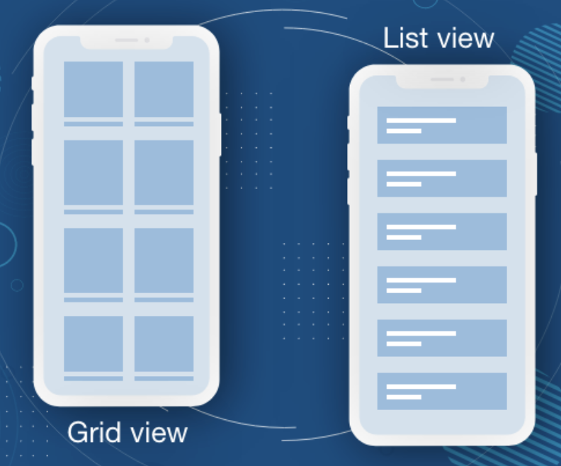
30.List
List is basically a VStack where we have a bunch of items in a list. if we want to swipe to delete an item or if we want to start moving items around
struct ListBootCamp: View {

@State var fruits: [String] = [
"apple", "orange", "banana", "peach"
]

@State  var veggies: [String] = [
"tomato", "potato", "carrots"
]

var body: some View {
NavigationView {
List {
Section(
header:
  HStack {
    Text("fruits".uppercased())
    Image(systemName: "flame.fill")
  } //: HSTACK
  .font(.headline)
  .foregroundColor(Color.orange)
) {
  ForEach(fruits, id: \.self) { fruit in
    Text(fruit.capitalized)
      .font(.body)
      .foregroundColor(.white)
      .padding(.vertical)


  }
  .onDelete(perform: delete)
  .onMove (perform: move)
  .listRowBackground(Color.blue)
}

Section(header: Text("Veggies".uppercased())) {
ForEach(veggies, id: \.self) { veggie in
  Text(veggie.capitalized)
}
}
}
.accentColor(.purple)
.navigationTitle("Grocery List")
.navigationBarItems(leading: EditButton(), trailing: addButton)
} //: NAVIGATION
.accentColor(.red)
}


func delete(indexSet: IndexSet) {
fruits.remove(atOffsets: indexSet)
}

func move(indices: IndexSet, newOffset: Int) {
fruits.move(fromOffsets: indices, toOffset: newOffset)
}

var addButton: some View {
Button {
} label: {
Text("Add")
}
}
}
<
31.alert
alert pops up right in the center of the screen and it has messages and one or two buttons
check to save something or show error messages sin alert popup
struct AlertsBootCamp: View {

@State var showAlert1: Bool = false
@State var showAlert2: Bool = false
@State var showAlert3: Bool = false
@State var showAlert4: Bool = false

@State var backgroundColor: Color = Color.yellow
@State var alertTitle: String = ""
@State var alertMessage: String = ""
@State var alertType: MyAlerts? = nil

// customize alerts and that's using an enum probably the most common way
// to actually do this in real app

enum MyAlerts {
case success
case error
}

var body: some View {

ZStack {

backgroundColor.ignoresSafeArea()

VStack (spacing: 20) {
  // 1
  Button {
    showAlert1.toggle()
  } label: {
    Text("First Alert")
  }
  .alert(isPresented: $showAlert1) {
    Alert(title: Text("There was an error!"))
  }

  // 2
  Button {
    showAlert2.toggle()
  } label: {
    Text("Second Alert")
  }
  .alert(isPresented: $showAlert2) {
    getAlert1()
  }

  // 3
  HStack (spacing: 10) {
    Button {
      alertTitle = "ERROR Uploading Video"
      alertMessage = "The video could not be uploaded"
      showAlert3.toggle()
    } label: {
      Text("Thrid Alert 1")
    }

    Button {
      alertTitle = "Successfully uploaded video 😄"
      alertMessage = "Your video is now public!"
      showAlert3.toggle()
    } label: {
      Text("Thrid Alert 2")
    }

  } //: HSTACK
  .alert(isPresented: $showAlert3) {
    getAlert2()
  }

  // 4
  HStack (spacing: 10) {
    Button {
      alertType = .error
      showAlert4.toggle()
    } label: {
      Text("Forth Alert 1")
    }

    Button {
      alertType = .success
      showAlert4.toggle()
    } label: {
      Text("Forth Alert 2")
    }
  } //: HSTACK
  .alert(isPresented: $showAlert4) {
    getAlert3()
  }

} //: VSTACK
} //: ZSTACK
}

// MARK: -  FUNCTION
func getAlert1() -> Alert {
  return Alert(
    title: Text("This is the title"),
    message: Text("Here we will describe the error"),
    primaryButton: .destructive(Text("Delete"), action: {
      backgroundColor = .red
    }),
    secondaryButton: .cancel())
}

func getAlert2() -> Alert {
  return Alert(
    title: Text(alertTitle),
    message: Text(alertMessage),
    dismissButton: .default(Text("OK")))
}

func getAlert3() -> Alert {
  switch alertType {
  case .error:
    return Alert(title: Text("There was an error! 🤢"))
  case .success:
    return Alert(title: Text("This was a success! 👍"), dismissButton: .default(Text("OK"), action: {
      backgroundColor = .green
    }))
  default:
    return Alert(title: Text("Error"))
  }
}
}
<
32.ActionSheet
Action sheets pop up from the bottom of the screen and able to add a whole bunch of buttons whereases the alet was limited to two buttons
struct ActionSheetBootCamp: View {

@State var showActionSheet1: Bool = false
@State var showActionSheet2: Bool = false
@State var actionSheetOption: ActionSheetOptions = .isOtherPost

enum ActionSheetOptions {
case isMyPost
case isOtherPost
}

var body: some View {
VStack (spacing: 10) {
// 1
Button {
  showActionSheet1.toggle()
} label: {
  Text("Action sheet 1")
}
.actionSheet(isPresented: $showActionSheet1) {
  getActionSheet1()
}

// 2
VStack {
  HStack {

    Circle()
      .frame(width: 30, height: 30)

    Text("@username")

    Spacer()

    Button {
      // actionSheetOption = .isOtherPost
      actionSheetOption = .isMyPost
      showActionSheet2.toggle()
    } label: {
      Image(systemName: "ellipsis")
    }
    .accentColor(.primary)

  } //: HSTACK
  .padding(.horizontal)

  Rectangle()
    .aspectRatio(1.0, contentMode: .fit)
} //: VSTACK
.actionSheet(isPresented: $showActionSheet2) {
  getActionSheet2()
}

} //: VSTACK
}

// MARK: - FUNCTION
func getActionSheet1() -> ActionSheet {

let button1: ActionSheet.Button = .default(Text("Default"))
let button2: ActionSheet.Button = .destructive(Text("Destructive"))
let button3: ActionSheet.Button = .cancel()

return ActionSheet(
  title: Text("This is the title!"),
  message: Text("This is the message"),
  buttons:  [button1, button1, button1, button1, button2, button3])
}

func getActionSheet2() -> ActionSheet {
let shareButton: ActionSheet.Button = .default(Text("Share")) {
  // add code to share post
}
let reportButton: ActionSheet.Button = .default(Text("Report")) {
  // add code to repoart this post
}
let deleteButton: ActionSheet.Button = .destructive(Text("Delete")) {
  // add code to delete this post
}
let cancelButton: ActionSheet.Button = .cancel()
let title = Text("What would you like to do?")

switch actionSheetOption {
case .isOtherPost:
  return ActionSheet(
    title: title,
    message: nil,
    buttons: [shareButton, reportButton, cancelButton])
case .isMyPost:
  return ActionSheet(
    title: title,
    message: nil,
    buttons: [shareButton, reportButton, deleteButton, cancelButton])
}
}
}
<
33.ContextMenu
It’s basically another way that we can present a bunch of different buttons to the user to click and hold on an object a little context menu pops up next to the object and then we can add a bunch of different buttons for the user to click
struct ContextMenuBootCamp: View {

@State var backgroundColor: Color = Color.cyan

var body: some View {
VStack (alignment: .leading, spacing: 10) {
  Image(systemName: "house.fill")
    .font(.title)
  Text("Swiftui awesome")
    .font(.headline)
  Text("How to use Context Menu")
    .font(.subheadline)
} //: VSTACK
.foregroundColor(.white)
.padding(30)
.background(backgroundColor.cornerRadius(30))
.contextMenu {

  Button {
    backgroundColor = .yellow
  } label: {
    Label("Share post", systemImage: "flame.fill")
  }

  Button {
    backgroundColor = .red
  } label: {
    Text("Report post")
  }

  Button {
    backgroundColor = .green
  } label: {
    HStack {
      Text("Like post")
      Image(systemName: "heart.fill")
    } //: HSTACK
  }
}
}
}
<
34.TextField
This is the perfect component to put on the screen where users need to actually type something in
struct TextFieldBootCamp: View {

@State var textFieldText: String = ""
@State var dataArray: [String] = []
@State var showAlert5: Bool = false

var body: some View {

NavigationView {
VStack (spacing: 20) {
  TextField("Type Something here...", text: $textFieldText)
    // .textFieldStyle(RoundedBorderTextFieldStyle())
    .padding()
    .background(Color.gray.opacity(0.3).cornerRadius(10))
    .foregroundColor(.red)
    .font(.headline)

  Button {
    if textIsAppropriate() {
      saveText()
    }
  } label: {
    Text("save".uppercased())
      .padding()
      .frame(maxWidth: .infinity)
      .background(textIsAppropriate() ? Color.blue : Color.gray)
      .cornerRadius(10)
      .foregroundColor(.white)
      .font(.headline)
  }
  .disabled(!textIsAppropriate())

  ForEach(dataArray, id: \.self) { data in
    Text(data)
  }

  Spacer()
} //: VSTACK
.padding()
.navigationTitle("TextField Practice")
} //: NAVIGATION
}

// MARK: -  FUNCTION
func saveText() {
dataArray.append(textFieldText)
textFieldText = ""
}

func textIsAppropriate() -> Bool {
// Check text
if textFieldText.count >= 3 {
return true
}
return false
}
}
<
35.TextEditor
TextField is only one line type in. if you need multiple lines for the user to type something in that you have to use text editor
struct TextEditorBootCamp: View {

@State var textEditorText: String = "This is the starting text."
@State var savedText: String = ""

var body: some View {
NavigationView {
VStack (spacing: 20) {
  TextEditor(text: $textEditorText)
    .frame(height: 250)
  // backgroundColor 로 TextEditor 의 배경색을 변경 할 수 없음
    .colorMultiply(Color.gray.opacity(0.5))

  Button {
    savedText = textEditorText
  } label: {
    Text("Save".uppercased())
      .font(.headline)
      .foregroundColor(.white)
      .padding(20)
      .frame(maxWidth: .infinity)
      .background(Color.blue)
      .cornerRadius(10)
  }
  Text(savedText)

  Spacer()
} //: VSTACK
.padding(20)
.navigationTitle("TextEditor Practice")
} //: NAVIGATION
}
}
<
36.Toggle
Toggle is switch on and off to easy implement boolean type value
struct ToggleBootCamp: View {

@State  var toggleIsOn: Bool = false

var body: some View {
VStack {

  HStack {
    Text("Status:")
    Text(toggleIsOn ? "Online" : "Offline")
  } //: HSTACK
  .font(.title)
  Toggle(
    isOn: $toggleIsOn) {
      Text("Change status")
    }
  .toggleStyle(SwitchToggleStyle(tint: Color.red))

  Spacer()
} //: VSTACK
.padding(.horizontal, 100)
}
}
<
37.Picker
User actually needs to pick from a couple different options are a bunch of different styles that we can use our picker to format it and make it look differently.
struct PickerBootCamp: View {

@State var selection: String = "Most Recent"
@State var selection2: String = "Most Recent"
let filterOptions: [String] = [
"Most Recent", "Most Popular", "Most Liked"
]

// UISegmentedControl.appearance() to update all of the segmented controls in the app
// this is overriding the appearance for all segmented controls
init() {
UISegmentedControl.appearance().selectedSegmentTintColor = UIColor.red

// 선택 되었을때 의 값이 white 로 변경해주기
let attributes: [NSAttributedString.Key:Any] = [
.foregroundColor : UIColor.white
]
UISegmentedControl.appearance().setTitleTextAttributes(attributes, for: .selected)
}


var body: some View {
VStack (spacing: 20) {

Picker(
  selection: $selection,
  label:
    HStack {
      Text("Filter:")
      Text(selection)
    }
  ,
  content: {
    ForEach(filterOptions, id: \.self) { option in
      HStack {
        Text(option)
        Image(systemName: "heart.fill")
      } //: HSTACK
      .tag(option)
    }
  })

Picker(
  selection: $selection2,
  label: Text("Picker"),
  content: {
    ForEach(filterOptions.indices) { index in
      Text(filterOptions[index])
        .tag(filterOptions[index])
    }
  })
  .pickerStyle(SegmentedPickerStyle())
  // .background(Color.red)
} //: VSTACK
}
}
<
38.ColorPicker
Users to pick from literally any color and add that into the app
struct ColorPickerBootCamp: View {

@State var backgroundColor: Color = .green

var body: some View {
ZStack {
// background
backgroundColor.ignoresSafeArea()

ColorPicker("Select a color",
            selection: $backgroundColor,
            supportsOpacity: true)
  .padding()
  .background(Color.black)
  .cornerRadius(10)
  .foregroundColor(.white)
  .font(.headline)
  .padding(50)
}
}
}
<
39.DatePicker
Users pick the date and time in an App
struct DatePickerBootCamp: View {

@State var selectedDate1: Date = Date()
@State var selectedDate2: Date = Date()
@State var selectedDate3: Date = Date()
@State var selectedDate4: Date = Date()
@State var selectedDate5: Date = Date()
@State var selectedDate6: Date = Date()

// current.date.provides an optional in date is not actually available
// Add exclamation point 느낌표 로 하면 error 가 없어지는데 optional 을 무조건 강제로 하는거
// ?? optional 처리 해주기
let startingDate: Date = Calendar.current.date(from: DateComponents(year: 2018)) ?? Date()
let endingDate: Date = Date() // endingDate set in today

// DateFormatter
var dateFormatter: DateFormatter {
  let formatter = DateFormatter()
  formatter.dateStyle = .medium
  formatter.timeStyle = .short
  return formatter
}

var body: some View {

VStack (spacing: 20) {

DatePicker("Default style date Picker", selection: $selectedDate1)
  .accentColor(Color.red)
  .datePickerStyle(.compact) // default style

Divider()

DatePicker("graphical picker", selection: $selectedDate2)
  .datePickerStyle(.graphical) // graphical style

Divider()

DatePicker("wheel type picker", selection: $selectedDate3)
  .datePickerStyle(.wheel) // wheel style

} //: VSTACK

VStack (spacing: 20) {
DatePicker("시간 분만 선택",
            selection: $selectedDate4,
            displayedComponents: [.hourAndMinute])

Divider()
DatePicker("Starting, Ending Date 지정",
            selection: $selectedDate5,
            in: startingDate...endingDate,
            displayedComponents: [.date])

Divider()
Text("Selected date is: ".uppercased())
Text(dateFormatter.string(from: selectedDate6))
  .font(.title)
DatePicker("Display Date",
            selection: $selectedDate6,
            in: startingDate...endingDate,
            displayedComponents: [.date])
} //: VSTACK
}
}
< <
<
40.Stepper
Users need to increment or decrement a value, you can use a stepper
Default stepper when you press the plus or minus it goes up or down one by one and able to customize the stepper
struct StepperBootCamp: View {

@State var stepperValue1: Int = 10
@State var widthIncrement: CGFloat = 0

var body: some View {
VStack {
  Stepper("Stepper: \(stepperValue1)", value: $stepperValue1)
    .padding(50)

  Divider()

  RoundedRectangle(cornerRadius: 25.0)
    .frame(width: 100 + widthIncrement, height: 100)

  Stepper("Stepper 2") {
    // increment
    incrementWidth(amount: 20)
  } onDecrement: {
    // decrement
    incrementWidth(amount: -20)
  }

} //: VSTACK
}

// MARK: -  FUNCTION
func incrementWidth(amount: CGFloat) {
withAnimation (.easeInOut) {
  widthIncrement += amount
}
}
}
<
41.Slider
Slider component that you can literally slide back and forth across your screen and when you slide you can get different values form the slider
Customize these sliders to use your own data sets so if you want to go from one to five or if you want to go from one to a hundred can customize
By customizing the slider with minimum and maximum labels changing the color and really just getting overall comfortable using the slider
struct SliderBootCamp: View {

@State var sliderValue: Double = 3
@State var color: Color = .blue

var body: some View {
VStack (spacing: 20) {

  HStack {
    Text("Rating:")
    Text("\(sliderValue)")
    // format number 0 decimal places : Int 형태의 숫자만 보이게 됨
    Text(String(format: "%.0f", sliderValue))
  }
  .foregroundColor(color)
  // Slider value: BinaryFloatingPoint is just number
  // in : full range of slider
  // step: 1.0 it only will increment or decrement 1
  // onEditingChanged: when code value changed slider changed
  Slider(
    value: $sliderValue,
    in: 1...5,
    step: 1.0,
    onEditingChanged: { _ in
      color = .red
    },
    minimumValueLabel: Text("1").font(.title),
    maximumValueLabel: Text("5").font(.title),
    label: {
      Text("Title")
    })
    .accentColor(.red)
} //: VSTACK
}
}
<
42.Tab bar TabView and PageTabViewStyle
This is the default way to get those tabs at the bottom of the app and you click the tabs it changes the page
You can basically take a tab view turn it into a pager and then you can actually swipe between all of the tabs
// TabView Example

struct TabViewBootCamp: View {

@State var selectedTab: Int = 2

var body: some View {
// selection: the tab view to know which is tab of these tabs is number and add tag
TabView (selection: $selectedTab){
HomeView(selectedTab: $selectedTab)
  .tabItem {
    Image(systemName: "house.fill")
    Text("HOME")
  }
  .tag(0)

Text("Browse Tab")
  .tabItem {
    Image(systemName: "globe")
    Text("Browse")
  }
  .tag(1)

Text("Profile Tab")
  .tabItem {
    Image(systemName: "person.fill")
    Text("Profile")
  }
  .tag(2)
}
.accentColor(.red)
}
}

struct TabViewBootCamp_Previews: PreviewProvider {
static var previews: some View {
TabViewBootCamp()
}
}

struct HomeView: View {

@Binding var selectedTab: Int

var body: some View {
ZStack {
Color.red.edgesIgnoringSafeArea(.top)
VStack (spacing: 20) {
  Text("Home Tab")
    .font(.largeTitle)
    .foregroundColor(.white)

  Button {
      selectedTab = 2
  } label: {
    Text("Goto Profile")
      .font(.headline)
      .padding(20)
      .padding(.horizontal)
      .background(Color.white)
      .cornerRadius(10)
  }

} //: VSTACK
} //: ZSTACK
}
}
<
// PageTabView

struct TabViewBootCamp: View {

let icons: [String] = [
"heart.fill", "globe", "house.fill", "person.fill"
]

var body: some View {

// It is like a scrollable paging view
TabView {
  ForEach(icons, id: \.self) { icon in
    Image(systemName: icon)
      .resizable()
      .scaledToFit()
      .padding(30)
  }
}
.background(
  RadialGradient(gradient: Gradient(colors: [Color.red, Color.blue]), center: .center, startRadius: 5, endRadius: 300)
)
.frame(height: 300)
.tabViewStyle(.page)
}
<
43.Dark Mode
Some colors are adaptable and switch light and dark mode other colors like when you explicitly put in Color.black would not be adaptable
You can add global colors that are adaptable and then you are going to look at how can locally adapt colors within your view
You are going to use an environment object called color schemes and based on the color scheme whether it is in light mode or dark mode. You will add logic into our modifiers to customize the color of whatever object that modifier is on
In 2022, most apps these days are supporting both light and dark mode
struct DarkModeBootCamp: View {

@Environment(\.colorScheme) var colorScheme

var body: some View {
NavigationView {
ScrollView {
  VStack (spacing: 20) {
    // primary and seconday color automatically adaptable
    Text("This text is Primary")
      .foregroundColor(.primary)
    Text("This color is Seconday")
      .foregroundColor(.secondary)
    // black, white color not adaptable
    Text("This Color is Black")
      .foregroundColor(.black)
    Text("This color is White")
      .foregroundColor(.white)
    Text("This Color is RED")
      .foregroundColor(.red)
    // Asset 에서 adaptiveColor set 을 만든후 light, dark mode 에서 색 설정해줌
    Text("This color is globally adaptive!")
      .foregroundColor(Color("AdaptiveColor"))
    // @Enviroment 사용해서 colorScheme 사용하기
    Text("This color is locally adaptive")
      .foregroundColor(colorScheme == .light ? .green : .yellow)
  } //: VSTACK
} //: SCROLL
.navigationTitle("Dark Mode Bootcamp")
} //: NAVIGATION
}
}

struct DarkModeBootCamp_Previews: PreviewProvider {
static var previews: some View {
  Group {
    DarkModeBootCamp()
    .preferredColorScheme(.light)
    DarkModeBootCamp()
    .preferredColorScheme(.dark)
  }
}
}
< <
<
44.Add Markups and Docs
Documentation needs to understand what’s going on they would understand the structure where certain things are on certain screens
struct DocumentationBootCamp: View {

// MARK: -  PROPERTY
@State var data: [String] = [
"Apples", "Oranges", "Bananas"
]
@State var showAlert: Bool = false

// MARK: -  BODY

/*
Working copy = things to do :
1) Fix tilte
2) Fix alert
3) Fix something else
*/
var body: some View {
NavigationView {
  ZStack {
    // background
    Color.red.ignoresSafeArea()

    // foreground
    foregroundLayer
    .navigationTitle("Documentation")
    .navigationBarItems(
      trailing: Button("ALERT", action: {
        showAlert.toggle()
      })
    )
    .alert(isPresented: $showAlert) {
      getAlert(text: "This is the alert")
    }
  }  //: ZSTACK
} //: NAVIGATION
}

// /// 를 3개를 하게되면 Summary 에 등록이되어서 option 클릭하게 되면 summary 를 볼수 있다
/// This is the foreground layer that holds a scrollView.
private var foregroundLayer: some View {
  ScrollView {
    Text("Hello")
    ForEach(data, id: \.self) { name in
      Text(name)
        .font(.headline)
    }
  } //: Scroll
}

// MARK: -  FUNCTION
/// Gets an alert with a spicified title
///
/// This function created and returns an alert immediately. The alert will have a title based on the text parameter but it will NOT have a message
/// ```
/// getAlert(text: "Hi") -> Alert(title: Text("Hi))
/// ```
/// - Warning: There is no additional in this Alert
/// - Parameter text: This is the title for alert
/// - Returns: Returns an alert with a title
func getAlert(text: String) -> Alert {
  return Alert(title: Text(text))
}
}

// MARK: -  PREVIEW
struct DocumentationBootCamp_Previews: PreviewProvider {
static var previews: some View {
  DocumentationBootCamp()
}
}
<
45.onAppear and onDisappear
When you maybe don’t want to actually load data you don’t want to fetch that data from your database until it appears on the screen
Or something like an image where you don’t want to actually download the image unless it’s going to actually be on the screen that would be a perfect situation for the on appear call to implement.
struct OnAppearBootCamp: View {

@State var myText: String = "Start text."
@State var count: Int = 0

var body: some View {
NavigationView {
ScrollView {
Text(myText)
LazyVStack {
ForEach(0..<50) { _ in
  RoundedRectangle(cornerRadius: 25.0)
    .frame(height: 200)
    .padding(20)
    .onAppear {
      count += 1
    }
}
}
} //: SCROLL
// .onAppear is handy need to load certain things when the viewx come onto the screen
.onAppear(perform: {
  // dispatchQueue adding a delay into this function
  DispatchQueue.main.asyncAfter(deadline: .now() + 2) {
    myText = "This is the new text!"
  }
})
// .onDisappear is predominantly used for cleaning up things if you somting
// that's ending function on here and want to cancel all those functions
// when the user leaves the screen use it
.onDisappear(perform: {
  myText = "Ending text"
})
.navigationTitle("On Appear: \(count)")
} //: NAVIGATION
}
}
<
46.if let and guard statements
If you have optionals in your code you’re going to safely unwrap them so you can always be sure and check whether or not you have values whether or not that optional variable is actually nil
To use if let statements and guard let statements lead that safe coding
struct IfLetGuardBootCamp: View {

@State var currentUserID: String?  = "test0123"
@State var displayText: String? = nil
@State var isLoading: Bool = false

var body: some View {
NavigationView {
  VStack {
    Text("Here we are practing safe coding")

    // String 을 optional 로 처음 값을 nil 로 하고 싶으면 if let text 해줘서
    // optional value 가 아닌 actual value 로 선언 하기
    if let text = displayText {
      Text(text)
        .font(.title)
    }

    // Do not use ! Ever
    // Do not force unwarp values
    // Text(displayText!)
    // 	.font(.title)

    if isLoading {
      ProgressView()
    }

    Spacer()
  } //: VSTACK
  .navigationTitle("Safe Coding")
  .onAppear {
    // loadData()
    loadData2()
  }
} //: NAVIGATION
}

// MARK: -  FUNCTION
func loadData() {
if let userID = currentUserID {
  isLoading = true
  DispatchQueue.main.asyncAfter(deadline: .now() + 3) {
    displayText = "This is the new data! Userid is: \(userID)"
    isLoading = false
  }
} else {
  displayText = "Error. There is no User ID!"
}
}

// 위의 func loadData() 를 guard 문으로 작성하기
func loadData2() {
  guard let userID = currentUserID else {
    displayText = "Error. There is no User ID!"
    return
  }
  isLoading = true
  DispatchQueue.main.asyncAfter(deadline: .now() + 3) {
    displayText = "This is the new data! User id is: \(userID)"
    isLoading = false
  }
}
}
< <
<
47.onTapGesture
Tab gesture is essentially the same thing as adding a button into your app except instead of being a full button with full button features it is just a tap.
To customize you could do like double tap or triple tap as well
struct TapGestureBootCamp: View {

@State var isSelected: Bool = false

var body: some View {
VStack (spacing: 40) {

  RoundedRectangle(cornerRadius: 25.0)
    .frame(height: 200)
    .foregroundColor(isSelected ? Color.green : Color.red)

  Button {
    isSelected.toggle()
  } label: {
    Text("Button")
      .font(.headline)
      .foregroundColor(.white)
      .frame(height: 55)
      .frame(maxWidth: .infinity)
      .background(Color.blue)
      .cornerRadius(25)
  }

  Text("Single Tap Gesture")
    .font(.headline)
    .foregroundColor(.white)
    .frame(height: 55)
    .frame(maxWidth: .infinity)
    .background(Color.blue)
    .cornerRadius(25)
    .onTapGesture {
      isSelected.toggle()
    }

  Text("Double Tap Gesture")
    .font(.headline)
    .foregroundColor(.white)
    .frame(height: 55)
    .frame(maxWidth: .infinity)
    .background(Color.blue)
    .cornerRadius(25)
  // count 수가 tap click 수임
    .onTapGesture(count: 2) {
      isSelected.toggle()
    }
  Spacer()
} //: VSTACK
.padding(40)
}
}
<
48.Custom models Struct
In Swift, you can build custom data types and these are usually referred to as models.
Here are how you can implement them and use from model to view
import SwiftUI

// user Identifiable : all you need to do is add an id to each of users
struct UserModel: Identifiable{
// create a random user id string every time when you create a user model
let id: String = UUID().uuidString
let displayName: String
let userName: String
let followerCount: Int
let isVerified: Bool
}

struct ModelBootcamp: View {

@State var users: [UserModel] = [
UserModel(displayName: "Jacob", userName: "jacob123", followerCount: 100, isVerified: true),
UserModel(displayName: "Emma", userName: "emma1995", followerCount: 55, isVerified: false),
UserModel(displayName: "Christ", userName: "ninja", followerCount: 355, isVerified: false),
UserModel(displayName: "Sam", userName: "samsung", followerCount: 88, isVerified: true)
]

var body: some View {
NavigationView {
List {
ForEach(users) { user in
  HStack (spacing: 15) {

    Circle()
      .frame(width: 35, height: 35)

    VStack (alignment: .leading, spacing: 5) {

      Text(user.displayName)
        .font(.headline)

      Text("@\(user.userName)")
        .foregroundColor(.gray)
        .font(.caption)
    }  //: VSTACK

    Spacer()

    if user.isVerified {
      Image(systemName: "checkmark.seal.fill")
        .foregroundColor(.blue)
    }

    VStack {
      Text("\(user.followerCount)")
        .font(.headline)
      Text("Followers")
        .font(.caption)
        .foregroundColor(.gray)
    }  //: VSTACK
  } //: HSTACK
  .padding(.vertical, 10)
}
}
.listStyle(.insetGrouped)
.navigationTitle("Users")
} //: NAVIGATION
}
}
<
49.StateObject, ObservableObject
- ObservedObject 를 사용해서 ViewModel 만들기
// MARK: -  MODEL
struct FruitModel1: Identifiable {
let id: String = UUID().uuidString
let name: String
let count: Int
}

// MARK: -  VIEWMODEL
class FruitViewModel1: ObservableObject {

// Published property wrapper to purpose same thing as the @State wrapper ecept it's within a class
// when this fruit array gets changed it notifies this fruitViewModel it's going to publish the new changes
@Published var fruitArray: [FruitModel1] = []
@Published var isLoading: Bool = false

// MARK: -  FUCTION
func getFruits() {
  let fruit1 = FruitModel1(name: "Orange", count: 1)
  let fruit2 = FruitModel1(name: "Banana", count: 2)
  let fruit3 = FruitModel1(name: "Watermelon", count: 88)

  // add delay
  isLoading = true
  DispatchQueue.main.asyncAfter(deadline: .now() + 3.0) {
    self.fruitArray.append(fruit1)
    self.fruitArray.append(fruit2)
    self.fruitArray.append(fruit3)
    self.isLoading = false
  }
}

func deleteFruit(index: IndexSet) {
  fruitArray.remove(atOffsets: index)
}
}

// MARK: -  BODY
struct ViewModelBootCamp: View {

// if this object changes you need to update your view
@ObservedObject var fruitViewModel1: FruitViewModel1 = FruitViewModel1()

var body: some View {
NavigationView {
List {
  if fruitViewModel1.isLoading {
    ProgressView()
  } else {
    ForEach(fruitViewModel1.fruitArray) { fruit in
      HStack {
        Text("\(fruit.count)")
          .foregroundColor(.red)
        Text(fruit.name)
          .font(.headline)
          .bold()
      } //: HSTACK
    }
    .onDelete(perform: fruitViewModel1.deleteFruit)
  }
}
.listStyle(.grouped)
.navigationTitle("Fruit List")
.onAppear {
  fruitViewModel1.getFruits()
}
} //: NAVIGATION
}
<
- StateObject 을 사용해서 ViewModel 만들기
ObservedObject has a downside if view gets recreated so if it gets refreshed for whatever reason maybe there’s some animation just causes view to reload
So, @ObservedObject also reload above same issues. Usually in the app when you are downloading like data set so like users or whatever data is on the view you don’t really need it to reload (all the data the underlying data is not really changing)
Another property wrapper use is called @StateObject
Actually, @StateObject is the same thing as an observable object except basically if this view reloads if it re-renders this object will persist so it will not refresh
🔑 언제 @StateObject, @ObservableObject 을 사용해야 되는 걸까?
=> If it’s the first place you’re creating it in your app. First, use stateObject but if you’re passing it into a second view or sub view you should use ObservableObject
// MARK: -  MODEL
struct FruitModel1: Identifiable {
let id: String = UUID().uuidString
let name: String
let count: Int
}

// MARK: -  VIEWMODEL
class FruitViewModel1: ObservableObject {

// Published property wrapper to purpose same thing as the @State wrapper ecept it's within a class
// when this fruit array gets changed it notifies this fruitViewModel it's going to publish the new changes
@Published var fruitArray: [FruitModel1] = []
@Published var isLoading: Bool = false

init() {
  getFruits()
}

// MARK: -  FUCTION
func getFruits() {
  let fruit1 = FruitModel1(name: "Orange", count: 1)
  let fruit2 = FruitModel1(name: "Banana", count: 2)
  let fruit3 = FruitModel1(name: "Watermelon", count: 88)

  // add delay
  isLoading = true
  DispatchQueue.main.asyncAfter(deadline: .now() + 3.0) {
    self.fruitArray.append(fruit1)
    self.fruitArray.append(fruit2)
    self.fruitArray.append(fruit3)
    self.isLoading = false
  }
}

func deleteFruit(index: IndexSet) {
  fruitArray.remove(atOffsets: index)
}
}

// MARK: -  BODY
struct ViewModelBootCamp: View {

// @StateObejct -> Use this on Creation / Init
// @ObservedObject -> Use this for Subviews
@StateObject  var fruitViewModel1: FruitViewModel1 = FruitViewModel1()

var body: some View {
NavigationView {
List {
if fruitViewModel1.isLoading {
  ProgressView()
} else {
  ForEach(fruitViewModel1.fruitArray) { fruit in
    HStack {
      Text("\(fruit.count)")
        .foregroundColor(.red)
      Text(fruit.name)
        .font(.headline)
        .bold()
    } //: HSTACK
  }
  .onDelete(perform: fruitViewModel1.deleteFruit)
}
}
.listStyle(.grouped)
.navigationTitle("Fruit List")
.navigationBarItems(
trailing:
  NavigationLink(destination: RandomScreen( fruitViewModel1: fruitViewModel1), label: {
    Image(systemName: "arrow.right").font(.title)
  })
)
} //: NAVIGATION
}
}


// MARK: -  SecondScreen
struct RandomScreen: View {

@Environment(\.presentationMode) var presentationMode

// To get data from parentView you should use @ObservedObject
@ObservedObject var fruitViewModel1: FruitViewModel1

var body: some View {
ZStack {
Color.green.ignoresSafeArea()

VStack {
  ForEach(fruitViewModel1.fruitArray) { fruit in
    Text(fruit.name)
      .foregroundColor(.white)
      .font(.headline)
  }
  Button {
    presentationMode.wrappedValue.dismiss()
  } label: {
    Text("Go Back")
      .foregroundColor(.white)
      .font(.largeTitle)
      .fontWeight(.semibold)
  }
}

}
}
}
<
50.EnvironmentObject
all of the views in that hierarchy will have access to this object. so this is perfect if you have some sort of class or object that you want to use in a whole bunch of different screens and you don’t actually want to pass in that from screen to screen to screen ….
Instead you just pu it in the background put it in the environment and then each screen can individually reference this object to use @EnvironmentObject
@EnvironmentObject basically same thing as a stateObject except you can put in into the environment. You don’t have to actually pass this object around our app instead all of the views in our app in this hierarchy will automatically have access to this object
// MARK: -  VIEWMODEL
class HomeScreenViewModel: ObservableObject {
@Published var dataArray: [String] = []

init() {
  getData()
}

func getData() {
  self.dataArray.append(contentsOf: ["iPhone", "iPad", "iMac", "Apple Watch"])
}
}


struct EnvrionmentObjectBootCamp: View {

@StateObject var viewModel: HomeScreenViewModel = HomeScreenViewModel()

// MARK: -  BODY
var body: some View {
  NavigationView {
    List {
      ForEach(viewModel.dataArray, id: \.self) { item in
        NavigationLink {
          DetailView1(selectedItem: item)
        } label: {
          Text(item)
        }
      }
    }
    .navigationTitle("iOS Devices")
  }  //: NAVIGATION
  // create put in Object in enviroment to access all of these sub views that drive here
  .environmentObject(viewModel)
}
}

// MARK: -  DETAILVIEW

struct DetailView1: View {

let selectedItem: String

var body: some View {
ZStack {
  // background
  Color.orange.ignoresSafeArea()

  // foreground
  NavigationLink {
    DetailView2()
  } label: {
    Text(selectedItem)
      .font(.headline)
      .foregroundColor(.orange)
      .padding()
      .padding(.horizontal)
      .background(Color.white)
      .cornerRadius(30)
  }
}
}
}

struct DetailView2: View {

// there is an environment view model in the environment
@EnvironmentObject var viewModel: HomeScreenViewModel

var body: some View {
ZStack {
  // background
  LinearGradient(
    gradient: Gradient(colors: [Color(#colorLiteral(red: 0.4745098054, green: 0.8392156959, blue: 0.9764705896, alpha: 1)), Color(#colorLiteral(red: 0.1019607857, green: 0.2784313858, blue: 0.400000006, alpha: 1))]),
    startPoint: .topLeading,
    endPoint: .bottomTrailing)
    .ignoresSafeArea()

  // foreground
  ScrollView {
    VStack (spacing: 20) {
      ForEach(viewModel.dataArray, id: \.self) { item in
        Text(item)
      }

    }  //: VSTACK
    .foregroundColor(.white)
    .font(.largeTitle)
  } //: SCROLL
}
}
}

51.AppStorage
UIKit has user defaults. @AppStorage is same as one the swiftui version where you can save information so that if the user closes you app and then reopens your app that information is still safe.
This is perfect for situations when you have small pieces of data like your current user’s name, id or maybe the last the user signed in
struct AppStorageBootCamp: View {

// if you reopen your app it's automatically going to pull the name from the key
// @AppStorage stored in environment means you can access different Views when it was matched "key"
@AppStorage("name") var currentUserName: String?

var body: some View {
VStack (spacing: 20) {
  Text(currentUserName ?? "Add Name Here")

  Button {
    let name = "Emma"
      currentUserName = name
    // UserDefaults 로 app data 저장하기
    // UserDefaults.standard.set(name, forKey: "name")
  } label: {
    Text("Save".uppercased())
  }

} //: VSTACK
// .onAppear {
  // UserDefaults 데이터 가져오기
  // currentUserName = UserDefaults.standard.string(forKey: "name")
// }
}
}
<
52.User onBoarding with AppStorage and Transitions
// in IntroView

struct IntroView: View {

// AppStoage to keep it all lowercased and with no spaces (using underscore)
@AppStorage("signed_in") var currentUserSignedIn: Bool = false

var body: some View {
ZStack {
  // background
  RadialGradient(
    gradient: Gradient(colors: [Color(#colorLiteral(red: 0.5568627715, green: 0.3529411852, blue: 0.9686274529, alpha: 1)), Color(#colorLiteral(red: 0.3647058904, green: 0.06666667014, blue: 0.9686274529, alpha: 1))]),
    center: .topLeading,
    startRadius: 5,
    endRadius: UIScreen.main.bounds.height)
    .ignoresSafeArea()

  // if user is signed in
  // profile view
  // else
  // onboarding view
  if currentUserSignedIn {
    ProfileView()
      .transition(.asymmetric(
        insertion: .move(edge: .bottom),
        removal: .move(edge: .top)))
  } else {
    OnboardingView()
      .transition(.asymmetric(
        insertion: .move(edge: .top),
        removal: .move(edge: .bottom)))
  }
} //: ZSTACK
}
}
struct OnboardingView: View {
// MARK: -  PROPERTY
// Onboarding states:
/*
  0 - Welcome Screen
  1 - Add name
  2 - Add age
  3 - Add gender
  */
@State var onboardingState: Int = 0
let transition: AnyTransition = .asymmetric(
  insertion: .move(edge: .trailing),
  removal: .move(edge: .leading))

// onboarding inputs
@State var name: String = ""
@State var age: Double = 50
@State var gender: String = ""

// for the alert
@State var alertTitle: String = ""
@State var showAlert: Bool = false

// app storage
// why optional in AppStorage: if you open the app and you did not actually set anything
// yet these will all be nil but if you did set them of course they have values
@AppStorage("name") var currentUserName: String?
@AppStorage("age") var currentUserAge: Int?
@AppStorage("gender") var currentUserGenter: String?
@AppStorage("signed_in") var currentUserSignedIn: Bool = false

// MARK: -  BODY
var body: some View {
ZStack {
  // content
  ZStack {
    switch onboardingState {
    case 0:
      welcomeSection
        .transition(transition)
    case 1:
      addNameSection
        .transition(transition)
    case 2:
      addAgeSection
        .transition(transition)
    case 3:
      addGenderSection
        .transition(transition)
    default:
      RoundedRectangle(cornerRadius: 25.0)
        .foregroundColor(.green)
    }
  }  //: ZSTACK

  // buttons
  VStack {
    Spacer()
    bottomButton
  }  //: VSTACK
  .padding(30)
}  //: ZSTACK
.alert(isPresented: $showAlert) {
  return Alert(title: Text(alertTitle))
}
}
}

// MARK: -  PREVIEW
struct OnboardingView_Previews: PreviewProvider {
static var previews: some View {
OnboardingView()
  .background(Color.purple)
}
}

// MARK: -  COMPONENTS
extension OnboardingView {

// bottomButton
private var bottomButton: some View {
Text(onboardingState == 0 ? "SIGN UP" :
      onboardingState == 3 ? "FINISH"	:
      "NEXT"
)
  .font(.headline)
  .foregroundColor(.purple)
  .frame(height: 55)
  .frame(maxWidth: .infinity)
  .background(Color.white)
  .cornerRadius(10)
  .animation(nil)
  .onTapGesture {
    handleNextButtonPressed()
  }
}

// welcomeSection
private var welcomeSection: some View {

VStack (spacing: 40) {

  Spacer()

  Image(systemName: "heart.text.square.fill")
    .resizable()
    .scaledToFit()
    .frame(width: 200, height: 200)
    .foregroundColor(.white)

  Text("Find your match")
    .font(.largeTitle)
    .fontWeight(.semibold)
    .foregroundColor(.white)
    .overlay(
      Capsule(style: .continuous)
        .frame(height: 3)
        .offset(y: 5)
        .foregroundColor(.white)
      , alignment: .bottom
    )

  Text("This is the #1 app for finding your match online! In this tutorial we are practicing using AppStorage and other SwiftUI techniquies.")
    .fontWeight(.medium)
    .foregroundColor(.white)

  Spacer()
  Spacer()
} //: VSTACK
.padding(30)
.multilineTextAlignment(.center)
}

// addNameSection
private var addNameSection: some View {
VStack (spacing: 20) {

  Spacer()

  Text("What's your name?")
    .font(.largeTitle)
    .fontWeight(.semibold)
    .foregroundColor(.white)

  TextField("Your name here...", text: $name)
    .font(.headline)
    .frame(height: 55)
    .padding(.horizontal)
    .background(Color.white)
    .cornerRadius(10)

  Spacer()
  Spacer()
} //: VSTACK
.padding(30)
}

// addAgeSection
private var addAgeSection: some View {
VStack (spacing: 20) {

  Spacer()

  Text("What's your age?")
    .font(.largeTitle)
    .fontWeight(.semibold)
    .foregroundColor(.white)


  Text("\(String(format: "%.0f", age))")
    .font(.largeTitle)
    .fontWeight(.semibold)
    .foregroundColor(.white)
  Slider(value: $age, in: 18...100, step: 1)
    .accentColor(.white)

  Spacer()
  Spacer()
} //: VSTACK
.padding(30)
}

// addGenderSection
private var addGenderSection: some View {
VStack (spacing: 20) {

  Spacer()

  Text("What's your Gender?")
    .font(.largeTitle)
    .fontWeight(.semibold)
    .foregroundColor(.white)

  Picker(selection: $gender) {
    Text("Male").tag("Male")
    Text("Female").tag("Female")
  } label: {
    Text(gender.count > 1 ? gender : "Select a gender")
      .font(.headline)
      .foregroundColor(.purple)
      .frame(height: 55)
      .frame(maxWidth: .infinity)
      .cornerRadius(10)
  }

  Spacer()
  Spacer()
} //: VSTACK
.padding(30)
}
}

// MARK: -  FUNCTION
extension OnboardingView {

func handleNextButtonPressed() {

// CHECK INPUTS
switch onboardingState {
case 1:
  guard name.count >= 3 else {
    showAlert(title: "Your name must be at least 3 characters long! 😂")
    return
  }
case 3:
  guard gender.count > 1 else {
    showAlert(title: "Please select a gender before moving forward! 😅")
    return
  }
default:
  break
}

// GO TO NEXT SECTION
if onboardingState == 3 {
  signIn()
} else {
  withAnimation(.spring()) {
    onboardingState += 1
  }
}
}

func signIn() {
currentUserName = name
currentUserAge = Int(age)
currentUserGenter = gender
withAnimation(.spring()) {
  currentUserSignedIn = true
}
}

func showAlert(title: String) {
alertTitle = title
showAlert.toggle()
}
}
struct ProfileView: View {
// MARK: -  PROPERTY

@AppStorage("name") var currentUserName: String?
@AppStorage("age") var currentUserAge: Int?
@AppStorage("gender") var currentUserGenter: String?
@AppStorage("signed_in") var currentUserSignedIn: Bool = false

// MARK: -  BODY
var body: some View {
VStack (spacing: 20) {
  Image(systemName: "person.circle.fill")
    .resizable()
    .scaledToFit()
    .frame(width: 150, height: 150)

  Text(currentUserName ?? "Your name here")
  Text("This user is \(currentUserAge ?? 0) years old!")
  Text("Their gender \(currentUserGenter ?? "unknown")")

  Text("SIGN OUT")
    .foregroundColor(.white)
    .font(.headline)
    .frame(height: 55)
    .frame(maxWidth: .infinity)
    .background(Color.black)
    .cornerRadius(10)
    .onTapGesture {
      signOut()
    }
} //: VSTACK
.font(.title)
.foregroundColor(.purple)
.padding()
.padding(.vertical, 40)
.background(Color.white)
.cornerRadius(10)
.shadow(radius: 10)
}

// MARK: -  FUNCTION
func signOut() {
currentUserName = nil
currentUserAge = nil
currentUserGenter = nil
withAnimation(.spring()) {
  currentUserSignedIn = false
}
}
}
<
53.AsyncImage iOS 15
- URL 에 있는 image 를 async 로 image 를 다운받아서 UI 에 처리합니다
/*
 async Image error 처리 ImagePhase
 case empty -> No image is loaded.
 case success(Image) -> An Image successfully loaded.
 case failure(Error) -> An image failed to load with an error
 */

struct AsyncImageBootCamp: View {
let url = URL(string: "https://picsum.photos/200")

var body: some View {

VStack (spacing: 20) {
// 일반적인 AsyncImage 사용 with ProgressView()
AsyncImage(url: url) { image in
  image
    .resizable()
    .scaledToFit()
    .frame(width: 200, height: 200)
    .cornerRadius(20)
} placeholder: {
  ProgressView()
}

Divider()

// switch 를 통한 Image error 처리
AsyncImage(url: url) { phase in
  switch phase {
  case .empty:
    ProgressView()
  case .success(let image):
    image
      .resizable()
      .scaledToFit()
      .frame(width: 200, height: 200)
      .cornerRadius(20)
  case .failure:
    Image(systemName: "questionmark")
      .font(.headline)
  default:
    Image(systemName: "questionmark")
      .font(.headline)
    }
  }
  }
}
}
- image 가 성공적으로 load 되었을때

- image 가 load 가 안될때 (error 처리)

54. Background Materials iOS 15
iOS 15 apple introduced system materials to swiftUI. It was already had system materials in UIKIT for a long time now.
This is basically background that it can put onto views that they are not necessarily specific colors but they are system materials transparency to tem so it looks like a very natural looking background
it you put like an image or something behind the material it will bleed through a little bit so it will look very natural
- Materials Options

struct BackgroundMaterialExample: View {
let url = URL(string: "https://picsum.photos/400")

var body: some View {
VStack{
  Spacer()

  VStack {
    RoundedRectangle(cornerRadius: 4)
      .frame(width: 50, height: 4)
      .padding()

    Spacer()
    Text("Example Background Material")
      .font(.headline)
      .vCenter()
  } //: VSTACK
  .frame(height: 350)
  .frame(maxWidth: .infinity)
  .background(.ultraThinMaterial)
  .cornerRadius(20)
} //: VSTACK
.background(
  AsyncImage(url: url) { image in
    image
      .resizable()
      .scaledToFill()
  } placeholder: {
    ProgressView()
  }
)
.ignoresSafeArea()
}
}

55.TextSelection iOS 15
Text selection modifier which is new in iOS 15 to SwiftUI
Users can then go and select the text in an App and they can copy it or they can share it with others
struct TextSelectionBootCamp: View {
var body: some View {
  // textSelection default is .enabled
  // you can also like copy images and capot maybe groups of texts and images
  Text("Hello, World!")
    .textSelection(.enabled)
}
}
<
56.ButtonStyle, controlSize iOS 15
In iOS15, Apple has provided new button styles for SwiftUI
Actually, custom button style looked at in there were much more functionaluty based. so it was when you are clicking on a button is that button going to shrink a little bit, change opacity and so on.
These button styles are a litte bit different. Basically giving us a pre-made background to the butoon. so the same way that you can go and add a frame, background, corner radius
And, new modifier called controlSize where you can actually just size these buttons automatically instead of having to set the frame and the width ourselves
struct ButtonStylesBootCamp: View {
var body: some View {
// accentColor 에 따라서 기본 color 값이 변경이 됨
VStack {
  Button("Button Title") {

  }
  .frame(height: 55)
  .frame(maxWidth: .infinity)
  .buttonStyle(.plain)

  Button("Button Title") {

  }
  .frame(height: 55)
  .frame(maxWidth: .infinity)
  .buttonStyle(.bordered)

  Button("Button Title") {

  }
  .frame(height: 55)
  .frame(maxWidth: .infinity)
  .buttonStyle(.borderedProminent)

  Button("Button Title") {

  }
  .frame(height: 55)
  .frame(maxWidth: .infinity)
  .buttonStyle(.borderless)

  Divider()

  // label 에 크기를 줄 경우
  Button {

  } label: {
    Text("Button Title")
      .frame(height: 55)
      .frame(maxWidth: .infinity)
  }
  .buttonStyle(.borderedProminent)
  .buttonBorderShape(.capsule)
  .controlSize(.large)

  // button 자체에 크기만 주기
  Button("Button Title") {

  }
  .frame(height: 55)
  .frame(maxWidth: .infinity)
  .buttonStyle(.borderedProminent)
  .controlSize(.large)

  Button("Button Title") {

  }
  .frame(height: 55)
  .frame(maxWidth: .infinity)
  .buttonStyle(.borderedProminent)
  .controlSize(.regular)

  Button("Button Title") {

  }
  .frame(height: 55)
  .frame(maxWidth: .infinity)
  .buttonStyle(.borderedProminent)
  .controlSize(.small)

  Button("Button Title") {

  }
  .frame(height: 55)
  .frame(maxWidth: .infinity)
  .buttonStyle(.borderedProminent)
  .controlSize(.mini)
} //: VSTACK
.padding()
}
}
<
57.SwipeActions iOS 15
Swipe actions allows you to add buttons into the swipe gesture on a list row
In iOS15, Add your own actions on the leading and trailing edge and change the button colors and have each actions
struct ListSwipeActionBootCamp: View {

@State var fruits: [String] = [
  "apple", "orange", "banana", "peach"
]

var body: some View {
List {
ForEach(fruits, id: \.self) {
Text($0.capitalized)
  .swipeActions(edge: .trailing, allowsFullSwipe: false) {
    Button("Archive") {

    }
    .tint(.green)
    Button("Save") {

    }
    .tint(.blue)
    Button("Junk") {

    }
    .tint(.black)
  }
  .swipeActions(edge: .leading, allowsFullSwipe: true) {
    Button("Share") {

    }
    .tint(.yellow)
  }
}
// .onDelete(perform: delete)
}
}

func delete(indexSet: IndexSet) {

}
}
<
58.Badge iOS 15
When you have a tab bar and you want to put a little icon indicating how maybw how many notifications are on that tab you do that using a badge
We’ve had badges in UIKit for a long time now but we did not have them in SwiftUI till iOS 15
// Badge can use in List and TabView
struct BadgesBootCamp: View {
var body: some View {
TabView  {
  Color.red
    .tabItem {
      Image(systemName: "heart.fill")
      Text("Hello")
    }
    .badge(0)

  Color.green
    .tabItem {
      Image(systemName: "heart.fill")
      Text("Hello")
    }
    .badge(5)


  Color.blue
    .tabItem {
      Image(systemName: "heart.fill")
      Text("Hello")
    }
    .badge("NEW")
}

// In List, .badge color is secondary color
List {
  Text("Hello")
    .badge("New ITEMS!")
  Text("Hello")
    .badge(10)
  Text("Hello")
  Text("Hello")
  Text("Hello")
}
}
}
< <
<
59.FocusState iOS 15
Basically before we had at focus state there was no way to programmatically select a text field and pop up the keyboard on the device
With FoucusState you can actually determine and programmatically pop up the keyboard by selecting a text field and you can also move the cursor from maybe one text field to another text field…
struct FocusStateBootCamp: View {

// usernameInFocus this boolean is going to be equal to whether or not
// that text field is currenty clicked
@FocusState private var usernameInFocus: Bool
@State private var username: String = ""

@FocusState private var passwordInFocus: Bool
@State private var password: String = ""

var body: some View {
VStack (spacing: 20) {
  TextField("Add your name here...", text: $username)
    .focused($usernameInFocus)
    .padding(.leading)
    .frame(height: 55)
    .frame(maxWidth: .infinity)
    .background(Color.gray.brightness(0.3))
    .cornerRadius(10)

  SecureField("Add your password here...", text: $password)
    .focused($passwordInFocus)
    .padding(.leading)
    .frame(height: 55)
    .frame(maxWidth: .infinity)
    .background(Color.gray.brightness(0.3))
    .cornerRadius(10)

  Button("sign up 💪🏻".uppercased()) {
    // username, password 의 값이 있는 경우 변수
    let usernameIsValid = !username.isEmpty
    let passwordIsValid = !password.isEmpty

    // 둘다 값이 있으면 Sin up 되고, username 만 되면 password 에 focus 되고, password 만 있으면 username 이 focus 되고
    if usernameIsValid && passwordIsValid {
      print("SIGN UP")
    } else if usernameIsValid {
      usernameInFocus = false
      passwordInFocus = true
    } else {
      usernameInFocus = true
      passwordInFocus = false
    }
  }

  Button("toggle focus state".uppercased()) {
    usernameInFocus.toggle()
  }
} //: VSTACK
.padding(40)
// autoFocus 되게 화면이 그려지고 나서 0.5초 뒤에 @FocusState 를 true 로 하게 되면 자동으로 textField 가 선택 되게 됨
.onAppear {
  DispatchQueue.main.asyncAfter(deadline: .now() + 0.5) {
    self.usernameInFocus = true
  }
}
}
}
- 위와 같은 로직인데, enum 으로 case 를 설정하고, fieldFoucus 하나만 @FocusState 를 처리해서 username field 에서 sign up 을 클릭하면 password 로 넘어가게 구현하기
struct FocusStateBootCamp: View {

enum OnboardingField: Hashable {
case username
case password
}

// usernameInFocus this boolean is going to be equal to whether or not
// that text field is currenty clicked
@State private var username: String = ""
@State private var password: String = ""
@FocusState private var fieldInFocus: OnboardingField?

var body: some View {
VStack (spacing: 20) {
  TextField("Add your name here...", text: $username)
    .focused($fieldInFocus, equals: .username)
    .padding(.leading)
    .frame(height: 55)
    .frame(maxWidth: .infinity)
    .background(Color.gray.brightness(0.3))
    .cornerRadius(10)

  SecureField("Add your password here...", text: $password)
    .focused($fieldInFocus, equals: .password)
    .padding(.leading)
    .frame(height: 55)
    .frame(maxWidth: .infinity)
    .background(Color.gray.brightness(0.3))
    .cornerRadius(10)

  Button("sign up 💪🏻".uppercased()) {
    // username, password 의 값이 있는 경우 변수
    let usernameIsValid = !username.isEmpty
    let passwordIsValid = !password.isEmpty

    // 둘다 값이 있으면 Sin up 되고, username 만 되면 password 에 focus 되고, password 만 있으면 username 이 focus 되고
    if usernameIsValid && passwordIsValid {
      print("SIGN UP")
    } else if usernameIsValid {
      fieldInFocus = .password
    } else {
      fieldInFocus = .username
    }
  }
} //: VSTACK
.padding(40)
}
}
<
60.onSubmit .submitLabel iOS 15
When the keyboard pops up on the device there’s a little return button in the bottom right corner of the keyboard and prior to iOS 15, we couldn’t do anything special in swiftUI with that button.
New on submit modifier we can now perform any action you want.
on .submitLabel can change the label on that return button that pops up on the keyboard
struct SubmitTextFeildBootCamp: View {

@State private var text: String = ""

var body: some View {
VStack (spacing: 20) {
  TextField("Placeholder...", text: $text)
    .submitLabel(.route)
    .onSubmit {
      print("Somthing to the console!")
    }

  TextField("Placeholder...", text: $text)
    .submitLabel(.next)
    .onSubmit {
      print("Somthing to the console!")
    }

  TextField("Placeholder...", text: $text)
    .submitLabel(.search)
    .onSubmit {
      print("Somthing to the console!")
    }
}
}
}
<
🗃 Reference
SwiftUI BootCamp in Swiftui Thinking - https://www.youtube.com/c/SwiftfulThinking
Leave a comment